Hey everyone, let's talk about a super important but often overlooked point in custom website development — "Mobile-First"!
Do you still think a website is all about creating a beautiful desktop version first, and then "adapting" it for mobile as an afterthought?
Wake up! That mindset is so outdated!
Imagine this: a potential client clicks a link from a social media post and opens your site on their phone. The result? It takes 5 seconds to load, images are broken, and buttons are so tiny you need a fingertip to press them. How much patience would she have? She'd probably close the tab in seconds! The traffic you worked so hard to attract is gone, just like that.
Why is "Mobile-First" not an option, but a MUST?
The Truth About Traffic: Data shows that now over 80%, even 90%, of web traffic comes from mobile devices. Your clients will see you for the first time—and most of the time—on their phones.
User Experience is King: A site that's smooth, beautiful, and easy to use on a phone builds instant professionalism and trust. It's like walking into a clean, well-lit physical store—it just makes you want to buy more!
Google's Preference: Search engines (especially Google) have long used mobile-friendliness as a core ranking factor. A site with a poor mobile experience is naturally left behind in search rankings.
So, what does a TRUE "Mobile-First" custom build actually do?
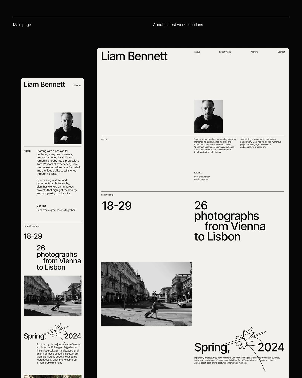
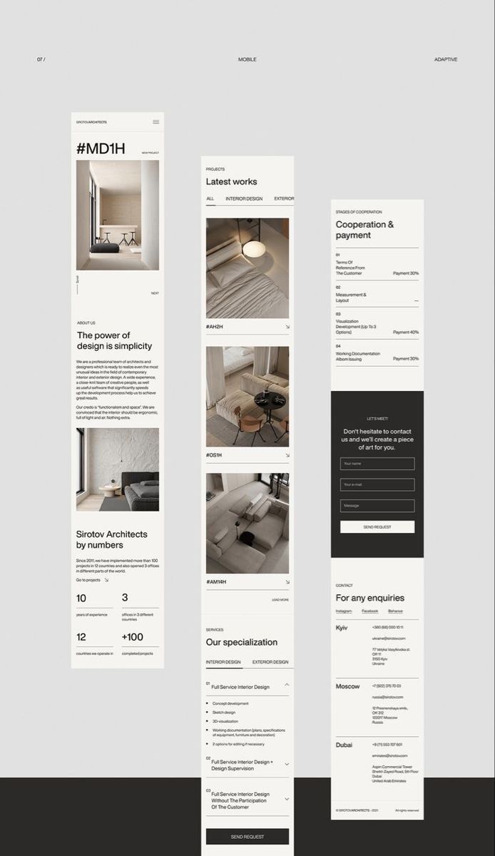
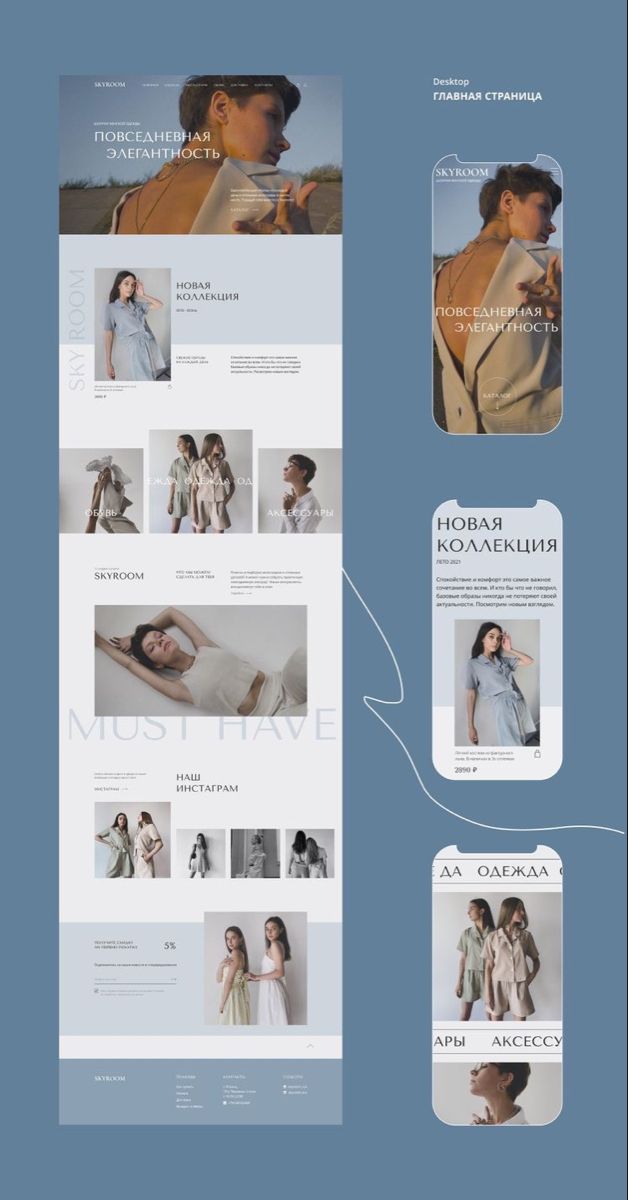
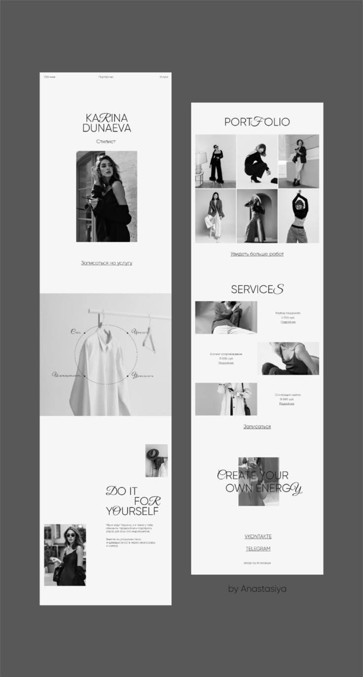
It's NOT just about squashing the desktop version to fit a small screen! It's about thinking and designing from the mobile screen from the very start:
A Flip in Design Thinking: The designer's first sketch is the mobile interface. The top priority is how to present your most important info (like your products, contact details, and core strengths) in the most direct and impressive way on that small screen.
Touch-First Interaction: Button sizes, spacing, and swipe fluidity are all tailored for fingertips, eliminating the frustration of mis-taps.
Speed is Everything: Images and code are compressed and optimized to the extreme, ensuring the site loads quickly, even on an unstable metro connection.
A Win for Content Priority: It forces you to identify your core content and strip away all the flashy, unnecessary elements. This actually makes communication more efficient!
In short, investing in a "Mobile-First" website is an investment in your conversion rate. It's like having a star salesperson working for you 24/7, always putting the most professional and friendly face forward at that critical first meeting.
If you're planning a new website or a redesign, make sure "Mobile-First" is a core requirement you seriously discuss with your design and development team!
This part of the budget? Worth every penny.
Ready to build your website and VI?
Get in touch to discuss your project needs and ideas.
Email: chris@sumaart.com  | Phone: +86 136 3281 6324