In the world of modern web design, two terms often get mixed up: adaptive design and responsive design. Both aim to deliver a smooth experience across different devices, but the way they achieve that goal is fundamentally different. Understanding this difference is essential for businesses planning a new website or redesign.
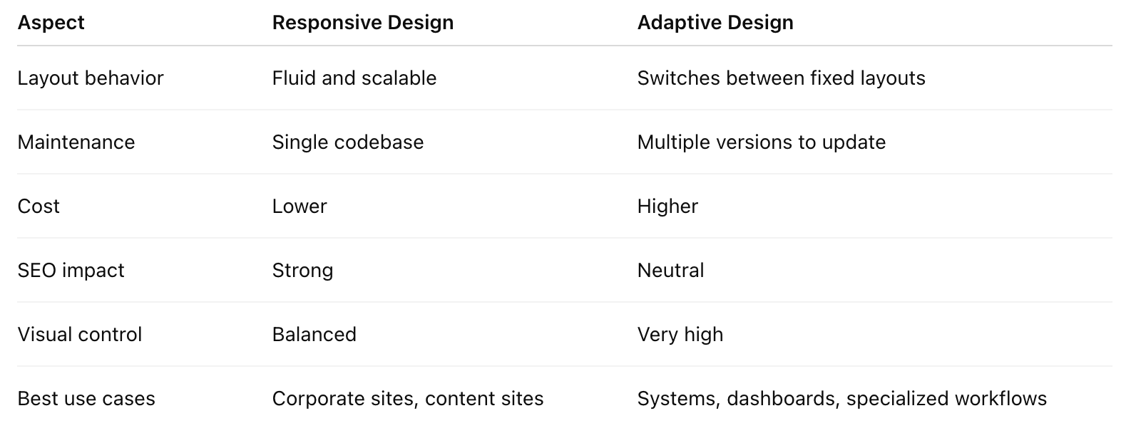
Responsive design relies on flexible grids and layouts that automatically adjust based on the browser’s width. Instead of designing for fixed screens, the content flows naturally across devices.
Key traits:
One layout that adapts smoothly across all screen sizes
Images and components scale proportionally
Consistent experience from desktop to mobile
Typically better for SEO and easier to maintain long-term
Responsive design works especially well for corporate websites, brand storytelling, and content-heavy platforms where consistency matters.
Adaptive design takes a different approach. Instead of one flexible layout, it uses several distinct layouts created for specific screen sizes. The website detects the device and serves the most appropriate version.
Key traits:
Multiple versions of the same page tailored to different devices
Greater control over how each screen size looks and behaves
Ideal for complex systems or apps that require device-specific workflows
Higher cost and more maintenance, since multiple layouts need updates
Adaptive design shines when a project requires precision or unique user flows on different devices.
Both methods aim to improve cross-device usability, which explains the confusion.
But their core approaches differ:
For most corporate websites, responsive design is the more practical and cost-effective choice. It offers a unified brand experience, performs well on search engines, and simplifies long-term maintenance.
Adaptive design is better suited for platforms requiring device-specific interactions, such as web apps, dashboards, or environments where precision is more important than scalability.
The real question isn’t which method is better. It’s which method aligns with your website’s goals.
The right approach depends on:
Content structure
User behavior across devices
Brand expression
SEO objectives
Maintenance capacity
Future scalability
A strong website strategy always starts with user experience, and the design method should support that—not the other way around.
If you're planning a new corporate website or considering a redesign, exploring the right design strategy early will save time, cost, and effort down the road.
Ready to build your website?
Get in touch to discuss your project needs and ideas.
Email: chris@sumaart.com  | Phone: +86 136 3281 6324